Many Bloggers put a lot of time and effort into creating a unique look for their blog, so today we’re excited to announce that custom templates are now also viewable from mobile devices.
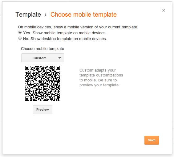
If you have a custom template for your blog and want it to appear on mobile browsers as well, visit the “Template” tab of your dashboard, click on the gear icon beneath the mobile template preview.

Then select “Custom” from the “Choose mobile template” pulldown.


If you have a custom template for your blog and want it to appear on mobile browsers as well, visit the “Template” tab of your dashboard, click on the gear icon beneath the mobile template preview.
Then select “Custom” from the “Choose mobile template” pulldown.

Your template may not look exactly the same on a mobile browser, so click “Preview” to make sure it appears the way you want it to before you save it.
If you have gadgets on your blog, you can also control which of them will be available in mobile view, using this new attribute:
mobile in <b:widget> tag. It can be 'default', 'yes', 'no', or 'only'.
The widgets that display on mobile by default are the following:
- Header
- Blog
- Profile
- PageList
- AdSense
- Attribution
The following widget will not be available in mobile view, because it’s a BlogArchive widget.
<b:widget id='BlogArchive1' title='Blog Archive' type='BlogArchive'>
To make it available in mobile view, add
mobile=’yes’ attribute to it.<b:widget id='BlogArchive1' mobile='yes' title='Blog Archive' type='BlogArchive'>
Setting
mobile to 'no' makes a widget not display in mobile view, even if available in mobile view by default.<b:widget id='Attribution1' mobile='no' title='Attribution' type='Attribution'>
You can also make a widget available only in mobile view by setting it to
'only'.<b:widget id='BlogArchive1' mobile='only' title='Blog Archive' type='BlogArchive'>
The content of a widget can modified for mobile view with the
boolean variable data:blog.isMobile.<div class="widget-content">
<b:if cond="data:blog.isMobile">
<!-- Show a text link in mobile view.-->
<a href="http://www.blogger.com">
Powered By Blogger
</a>
<b:else/>
<!-- Show an image link in desktop view.-->
<a href="http://www.blogger.com">
<img expr:src="data:fullButton" alt="Powered By Blogger"/>
</a>
</b:if>
</div>
The above template HTML shows different contents between desktop view and mobile view, depending on the value of the
data:blog.isMobile variable.
You can conditionally give different CSS properties to a same class between desktop view and mobile view, as the
<body>tag of Blogger mobile templates has mobile as its class. First, make sure the <body> tag of your custom template is same as the following one.<body expr:class='"loading" + data:blog.mobileClass'>
Then, you can define different CSS properties for desktop and mobile view.
/* For desktop view */
.date-posts {
  margin: 0 -$(separator.outdent);
  padding: 0 $(separator.outdent);
}

/* For mobile view */
.mobile .date-posts {
  margin: 0;
  padding: 0;
}
We hope you will enjoy making your very own mobile templates.
Updated: Changed
data:mobile to data:blog.isMobileRef By : http://code.blogger.com - brett
